Getting Started with Nuxt UI
Why Nuxt UI?
Tailwind CSS Powered
Built on Tailwind CSS with full theming support and CSS variables
Fully Accessible
WCAG compliant components with keyboard navigation and screen reader support
Dark Mode Ready
Seamless light and dark mode switching out of the box
Installation
Add Nuxt UI to your Nuxt project:
npx nuxi@latest module add ui
This automatically adds the module to your nuxt.config.ts:
export default defineNuxtConfig({
  modules: ["@nuxt/ui"],
})
Basic Components
Buttons
Nuxt UI buttons come with multiple variants and colors:
<template>
  <div class="flex gap-2">
    <UButton>Default</UButton>
    <UButton color="primary">Primary</UButton>
    <UButton color="success">Success</UButton>
    <UButton color="error" variant="outline">Error</UButton>
    <UButton color="warning" variant="soft">Warning</UButton>
  </div>
</template>
Inputs
Form inputs with built-in validation states:
<script setup>
  const email = ref("")
</script>

<template>
  <UInput v-model="email" placeholder="Enter your email" icon="i-lucide-mail" />
</template>
Cards
Create beautiful card layouts:
<template>
  <UCard>
    <template #header>
      <h3 class="font-semibold">Card Title</h3>
    </template>

    <p>Card content goes here.</p>

    <template #footer>
      <UButton>Action</UButton>
    </template>
  </UCard>
</template>
Form Handling
Build forms with validation using Nuxt UI's form components:
<script setup lang="ts">
  import { z } from "zod"

  const schema = z.object({
    name: z.string().min(2, "Name must be at least 2 characters"),
    email: z.string().email("Invalid email address"),
  })

  const state = reactive({
    name: "",
    email: "",
  })

  async function onSubmit() {
    console.log("Form submitted:", state)
  }
</script>

<template>
  <UForm :schema="schema" :state="state" @submit="onSubmit">
    <UFormField label="Name" name="name">
      <UInput v-model="state.name" />
    </UFormField>

    <UFormField label="Email" name="email">
      <UInput v-model="state.email" type="email" />
    </UFormField>

    <UButton type="submit">Submit</UButton>
  </UForm>
</template>
Icons
Nuxt UI uses Iconify for icons. Access 200,000+ icons from popular sets:
<template>
  <div class="flex gap-4">
    <!-- Lucide icons (default) -->
    <UIcon name="i-lucide-home" />
    <UIcon name="i-lucide-settings" />

    <!-- Heroicons -->
    <UIcon name="i-heroicons-heart" />

    <!-- Material Design Icons -->
    <UIcon name="i-lucide-github" />

    <!-- Simple Icons (brand logos) -->
    <UIcon name="i-simple-icons-nuxt" />
  </div>
</template>
Use icons in buttons and inputs:
<template>
  <UButton icon="i-lucide-plus">Add Item</UButton>
  <UButton icon="i-lucide-trash" color="error" variant="ghost" />
  <UInput icon="i-lucide-search" placeholder="Search..." />
</template>
Color System
Nuxt UI uses a flexible color system based on Tailwind CSS:
Available Colors
primary- Your main brand colorsecondary- Secondary brand colorsuccess- Success statesinfo- Informational stateswarning- Warning stateserror- Error statesneutral- Neutral/gray tones
Customizing Colors
Configure your colors in app.config.ts:
export default defineAppConfig({
  ui: {
    colors: {
      primary: "blue",
      secondary: "violet",
      success: "emerald",
      error: "red",
    },
  },
})
Dark Mode
Nuxt UI includes built-in dark mode support with the Color Mode module.
Dark Mode Toggle
Create a simple theme toggle:
<script setup>
  const colorMode = useColorMode()

  function toggleDarkMode() {
    colorMode.preference = colorMode.value === "dark" ? "light" : "dark"
  }
</script>

<template>
  <UButton
    :icon="colorMode.value === 'dark' ? 'i-lucide-sun' : 'i-lucide-moon'"
    color="neutral"
    variant="ghost"
    @click="toggleDarkMode"
  />
</template>
Theme Dropdown
Or use a dropdown for more options:
<script setup>
  const colorMode = useColorMode()

  const themes = [
    { label: "Light", value: "light", icon: "i-lucide-sun" },
    { label: "Dark", value: "dark", icon: "i-lucide-moon" },
    { label: "System", value: "system", icon: "i-lucide-monitor" },
  ]
</script>

<template>
  <UDropdownMenu :items="themes">
    <UButton icon="i-lucide-palette" variant="ghost" />
  </UDropdownMenu>
</template>
Navigation Components
Navigation Menu
Build responsive navigation:
<script setup>
  const items = [
    { label: "Home", icon: "i-lucide-home", to: "/" },
    { label: "Products", icon: "i-lucide-box", to: "/products" },
    { label: "About", icon: "i-lucide-info", to: "/about" },
    { label: "Contact", icon: "i-lucide-mail", to: "/contact" },
  ]
</script>

<template>
  <UNavigationMenu :items="items" />
</template>
Breadcrumbs
Show navigation hierarchy:
<script setup>
  const items = [
    { label: "Home", to: "/" },
    { label: "Products", to: "/products" },
    { label: "Laptops", to: "/products/laptops" },
  ]
</script>

<template>
  <UBreadcrumb :items="items" />
</template>
Modals and Overlays
Modal Dialog
<script setup>
  const isOpen = ref(false)
</script>

<template>
  <UButton @click="isOpen = true">Open Modal</UButton>

  <UModal v-model:open="isOpen">
    <template #header>
      <h3>Modal Title</h3>
    </template>

    <p>Modal content goes here.</p>

    <template #footer>
      <UButton @click="isOpen = false">Close</UButton>
    </template>
  </UModal>
</template>
Toast Notifications
Show feedback messages:
<script setup>
  const toast = useToast()

  function showToast() {
    toast.add({
      title: "Success!",
      description: "Your changes have been saved.",
      color: "success",
    })
  }
</script>

<template>
  <UButton @click="showToast">Show Toast</UButton>
</template>
Data Display
Tables
Display data in tables:
<script setup>
  const columns = [
    { key: "name", label: "Name" },
    { key: "email", label: "Email" },
    { key: "role", label: "Role" },
  ]

  const data = [
    { name: "Alice", email: "alice@example.com", role: "Admin" },
    { name: "Bob", email: "bob@example.com", role: "User" },
  ]
</script>

<template>
  <UTable :columns="columns" :rows="data" />
</template>
Badges
Highlight status or categories:
<template>
  <div class="flex gap-2">
    <UBadge>Default</UBadge>
    <UBadge color="success">Active</UBadge>
    <UBadge color="warning" variant="subtle">Pending</UBadge>
    <UBadge color="error" variant="outline">Inactive</UBadge>
  </div>
</template>
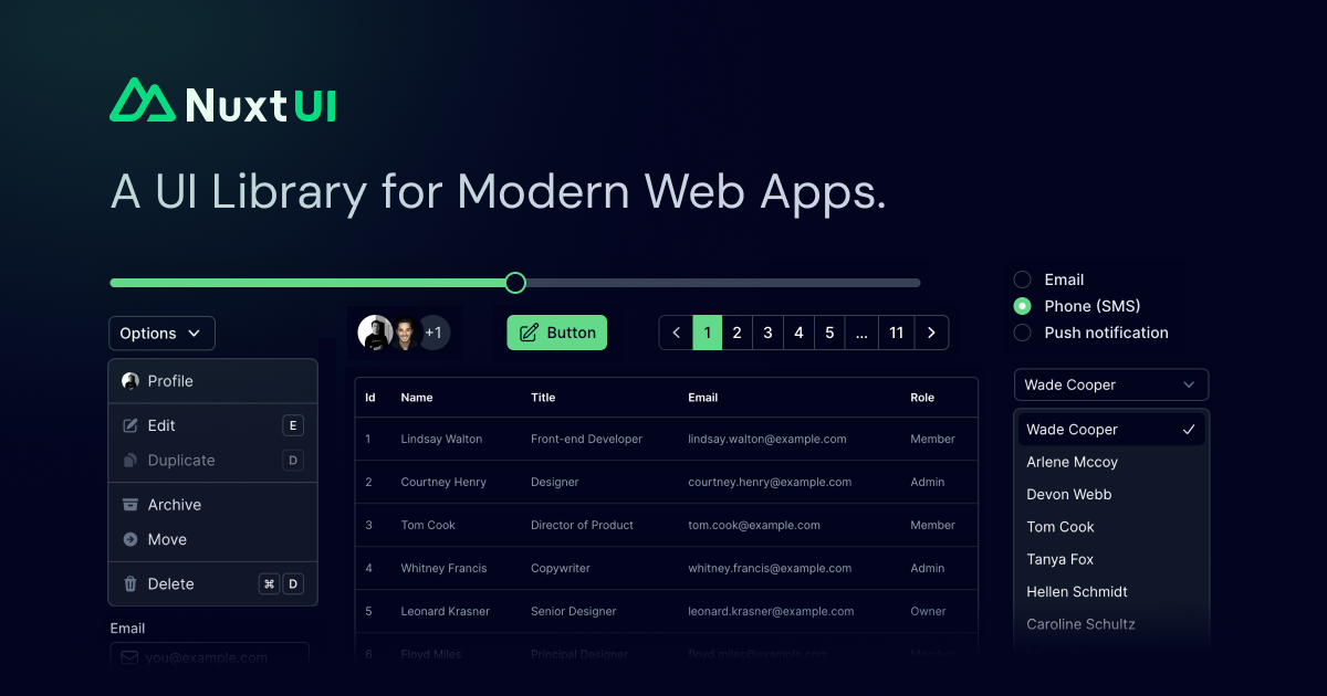
Key Features
50+ Components
From buttons to complex data tables and command palettes
TypeScript First
Full type safety with auto-generated component types
Customizable
Override any component style with Tailwind classes