Getting Started with PrimeVue
Why PrimeVue?
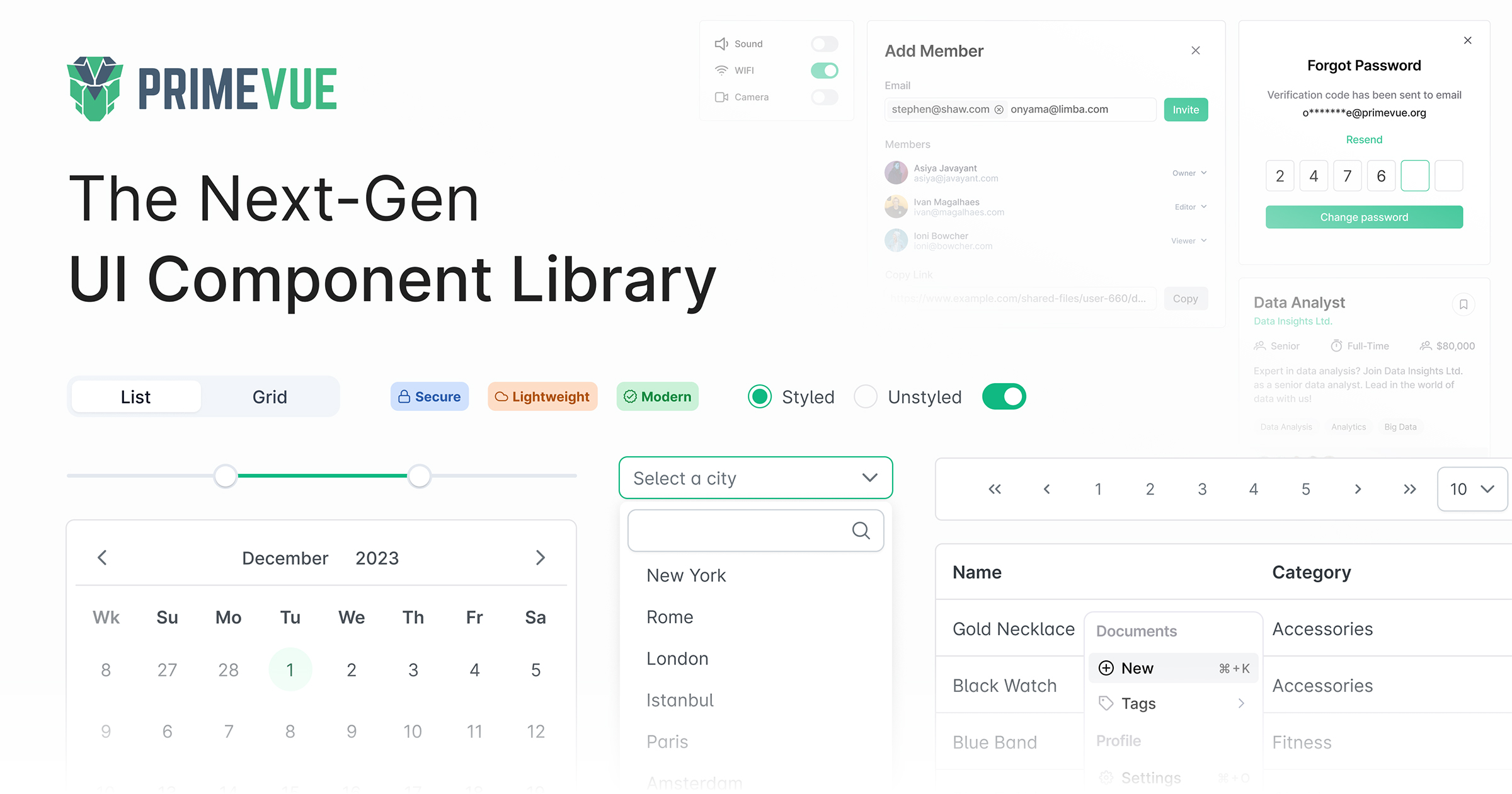
90+ Components
Everything from basic inputs to complex data tables, charts, and editors
Theme Designer
Built-in themes plus a visual theme designer for custom branding
Enterprise Ready
Professional support, long-term maintenance, and proven at scale
Installation
With Nuxt
Install the Nuxt module:
npm install @primevue/nuxt-module primevue
Configure in nuxt.config.ts:
export default defineNuxtConfig({
  modules: ["@primevue/nuxt-module"],
  primevue: {
    options: {
      theme: "none", // or use a preset theme
    },
  },
})
With Vue + Vite
npm install primevue @primevue/themes
// main.ts
import { createApp } from "vue"
import PrimeVue from "primevue/config"
import Aura from "@primevue/themes/aura"
import App from "./App.vue"

const app = createApp(App)
app.use(PrimeVue, {
  theme: {
    preset: Aura,
  },
})
app.mount("#app")
Basic Components
Buttons
PrimeVue buttons with variants, severities, and icons:
<template>
  <div class="flex gap-2">
    <Button label="Default" />
    <Button label="Primary" severity="primary" />
    <Button label="Success" severity="success" />
    <Button label="Danger" severity="danger" outlined />
    <Button label="Warning" severity="warning" text />
    <Button icon="pi pi-check" rounded />
  </div>
</template>
Button Severities
primary- Main actionsecondary- Secondary actionsuccess- Success/confirm actioninfo- Informational actionwarning- Warning actiondanger- Destructive actionhelp- Help/support actioncontrast- High contrast
InputText
Form inputs with various states:
<script setup>
  const value = ref("")
  const disabled = ref("")
  const invalid = ref("")
</script>

<template>
  <div class="flex flex-col gap-4">
    <InputText v-model="value" placeholder="Enter text" />
    <InputText v-model="disabled" placeholder="Disabled" disabled />
    <InputText v-model="invalid" placeholder="Invalid" invalid />
    <IconField>
      <InputIcon class="pi pi-search" />
      <InputText placeholder="Search" />
    </IconField>
  </div>
</template>
Cards
Create card layouts:
<template>
  <Card style="width: 25rem">
    <template #header>
      <img alt="Card image" src="/images/hero.jpg" />
    </template>
    <template #title>Card Title</template>
    <template #subtitle>Card Subtitle</template>
    <template #content>
      <p>Card content goes here. Add any text or components.</p>
    </template>
    <template #footer>
      <div class="flex gap-2">
        <Button label="Save" icon="pi pi-check" />
        <Button label="Cancel" severity="secondary" outlined />
      </div>
    </template>
  </Card>
</template>
Form Components
Select (Dropdown)
<script setup>
  const selectedCity = ref()
  const cities = ref([
    { name: "New York", code: "NY" },
    { name: "Los Angeles", code: "LA" },
    { name: "Chicago", code: "CHI" },
    { name: "Houston", code: "HOU" },
  ])
</script>

<template>
  <Select v-model="selectedCity" :options="cities" optionLabel="name" placeholder="Select a City" />
</template>
MultiSelect
<script setup>
  const selectedCities = ref([])
  const cities = ref([
    { name: "New York", code: "NY" },
    { name: "Los Angeles", code: "LA" },
    { name: "Chicago", code: "CHI" },
  ])
</script>

<template>
  <MultiSelect
    v-model="selectedCities"
    :options="cities"
    optionLabel="name"
    placeholder="Select Cities"
    :maxSelectedLabels="3"
  />
</template>
DatePicker (Calendar)
<script setup>
  const date = ref()
  const dateRange = ref()
</script>

<template>
  <div class="flex flex-col gap-4">
    <DatePicker v-model="date" placeholder="Select date" />
    <DatePicker v-model="dateRange" selectionMode="range" placeholder="Select range" />
    <DatePicker v-model="date" showTime hourFormat="12" placeholder="With time" />
  </div>
</template>
Checkbox and RadioButton
<script setup>
  const checked = ref(false)
  const selectedOption = ref("option1")
</script>

<template>
  <div class="flex flex-col gap-4">
    <div class="flex items-center gap-2">
      <Checkbox v-model="checked" inputId="agree" binary />
      <label for="agree">I agree to the terms</label>
    </div>

    <div class="flex flex-col gap-2">
      <div class="flex items-center gap-2">
        <RadioButton v-model="selectedOption" inputId="opt1" value="option1" />
        <label for="opt1">Option 1</label>
      </div>
      <div class="flex items-center gap-2">
        <RadioButton v-model="selectedOption" inputId="opt2" value="option2" />
        <label for="opt2">Option 2</label>
      </div>
    </div>
  </div>
</template>
Form Validation
Build forms with validation:
<script setup>
  import { useForm } from "vee-validate"
  import * as yup from "yup"

  const schema = yup.object({
    name: yup.string().required("Name is required").min(2),
    email: yup.string().required("Email is required").email("Invalid email"),
    password: yup.string().required("Password is required").min(8),
  })

  const { defineField, handleSubmit, errors } = useForm({
    validationSchema: schema,
  })

  const [name] = defineField("name")
  const [email] = defineField("email")
  const [password] = defineField("password")

  const onSubmit = handleSubmit((values) => {
    console.log("Form submitted:", values)
  })
</script>

<template>
  <form @submit="onSubmit" class="flex flex-col gap-4">
    <div class="flex flex-col gap-1">
      <label for="name">Name</label>
      <InputText id="name" v-model="name" :invalid="!!errors.name" />
      <small class="text-red-500">{{ errors.name }}</small>
    </div>

    <div class="flex flex-col gap-1">
      <label for="email">Email</label>
      <InputText id="email" v-model="email" type="email" :invalid="!!errors.email" />
      <small class="text-red-500">{{ errors.email }}</small>
    </div>

    <div class="flex flex-col gap-1">
      <label for="password">Password</label>
      <Password id="password" v-model="password" :invalid="!!errors.password" toggleMask />
      <small class="text-red-500">{{ errors.password }}</small>
    </div>

    <Button type="submit" label="Submit" />
  </form>
</template>
Icons
PrimeVue uses PrimeIcons:
npm install primeicons
// main.ts
import "primeicons/primeicons.css"
<template>
  <div class="flex items-center gap-4">
    <i class="pi pi-home" style="font-size: 1.5rem"></i>
    <i class="pi pi-user" style="font-size: 1.5rem"></i>
    <i class="pi pi-check" style="font-size: 1.5rem; color: green"></i>
    <i class="pi pi-times" style="font-size: 1.5rem; color: red"></i>
  </div>
</template>
Use icons in components:
<template>
  <Button icon="pi pi-plus" label="Add Item" />
  <Button icon="pi pi-trash" severity="danger" rounded />
  <Button icon="pi pi-download" label="Download" iconPos="right" />
</template>
Theming
PrimeVue includes several built-in theme presets:
import Aura from "@primevue/themes/aura"
import Lara from "@primevue/themes/lara"
import Nora from "@primevue/themes/nora"
Customizing Themes
// main.ts
import { createApp } from "vue"
import PrimeVue from "primevue/config"
import Aura from "@primevue/themes/aura"
import { definePreset } from "@primevue/themes"

const MyPreset = definePreset(Aura, {
  semantic: {
    primary: {
      50: "{emerald.50}",
      100: "{emerald.100}",
      200: "{emerald.200}",
      300: "{emerald.300}",
      400: "{emerald.400}",
      500: "{emerald.500}",
      600: "{emerald.600}",
      700: "{emerald.700}",
      800: "{emerald.800}",
      900: "{emerald.900}",
      950: "{emerald.950}",
    },
  },
})

app.use(PrimeVue, {
  theme: {
    preset: MyPreset,
  },
})
Dark Mode
Toggle between light and dark modes:
<script setup>
  const isDark = ref(false)

  function toggleDarkMode() {
    isDark.value = !isDark.value
    document.documentElement.classList.toggle("p-dark", isDark.value)
  }
</script>

<template>
  <Button
    :icon="isDark ? 'pi pi-sun' : 'pi pi-moon'"
    @click="toggleDarkMode"
    rounded
    text
    severity="secondary"
  />
</template>
Data Display
DataTable
Display and manage data:
<script setup>
  const products = ref([
    { code: "001", name: "Laptop", category: "Electronics", price: 999 },
    { code: "002", name: "Keyboard", category: "Electronics", price: 79 },
    { code: "003", name: "Mouse", category: "Electronics", price: 29 },
  ])
</script>

<template>
  <DataTable :value="products" tableStyle="min-width: 50rem">
    <Column field="code" header="Code" sortable />
    <Column field="name" header="Name" sortable />
    <Column field="category" header="Category" sortable />
    <Column field="price" header="Price" sortable>
      <template #body="{ data }"> ${{ data.price }} </template>
    </Column>
    <Column header="Actions">
      <template #body>
        <Button icon="pi pi-pencil" text rounded />
        <Button icon="pi pi-trash" text rounded severity="danger" />
      </template>
    </Column>
  </DataTable>
</template>
Advanced DataTable Features
<script setup>
  const products = ref([])
  const selectedProducts = ref([])
  const filters = ref({
    global: { value: null },
  })
</script>

<template>
  <DataTable
    v-model:selection="selectedProducts"
    v-model:filters="filters"
    :value="products"
    paginator
    :rows="10"
    :rowsPerPageOptions="[5, 10, 25]"
    filterDisplay="row"
    selectionMode="multiple"
    dataKey="id"
  >
    <template #header>
      <div class="flex justify-between">
        <h2>Products</h2>
        <IconField>
          <InputIcon class="pi pi-search" />
          <InputText v-model="filters.global.value" placeholder="Search..." />
        </IconField>
      </div>
    </template>

    <Column selectionMode="multiple" headerStyle="width: 3rem" />
    <Column field="name" header="Name" sortable filter />
    <Column field="category" header="Category" sortable filter />
    <Column field="price" header="Price" sortable />
  </DataTable>
</template>
Tag
Display status labels:
<template>
  <div class="flex gap-2">
    <Tag value="New" />
    <Tag value="Active" severity="success" />
    <Tag value="Pending" severity="warning" />
    <Tag value="Rejected" severity="danger" />
    <Tag value="Info" severity="info" icon="pi pi-info-circle" />
  </div>
</template>
Navigation
Menubar
<script setup>
  const items = ref([
    {
      label: "Home",
      icon: "pi pi-home",
      command: () => navigateTo("/"),
    },
    {
      label: "Products",
      icon: "pi pi-box",
      items: [
        { label: "New", icon: "pi pi-plus" },
        { label: "Search", icon: "pi pi-search" },
      ],
    },
    {
      label: "Contact",
      icon: "pi pi-envelope",
    },
  ])
</script>

<template>
  <Menubar :model="items">
    <template #start>
      <span class="font-bold">MyApp</span>
    </template>
    <template #end>
      <Button icon="pi pi-user" rounded text />
    </template>
  </Menubar>
</template>
Breadcrumb
<script setup>
  const home = ref({ icon: "pi pi-home", to: "/" })
  const items = ref([{ label: "Products", to: "/products" }, { label: "Laptops" }])
</script>

<template>
  <Breadcrumb :home="home" :model="items" />
</template>
TabView
<script setup>
  const activeIndex = ref(0)
</script>

<template>
  <TabView v-model:activeIndex="activeIndex">
    <TabPanel header="Details">
      <p>Details content here.</p>
    </TabPanel>
    <TabPanel header="Reviews">
      <p>Reviews content here.</p>
    </TabPanel>
    <TabPanel header="Shipping">
      <p>Shipping information here.</p>
    </TabPanel>
  </TabView>
</template>
Dialogs and Overlays
Dialog
<script setup>
  const visible = ref(false)
</script>

<template>
  <Button label="Open Dialog" @click="visible = true" />

  <Dialog v-model:visible="visible" header="Dialog Title" modal :style="{ width: '450px' }">
    <p>Dialog content goes here.</p>

    <template #footer>
      <Button label="Cancel" severity="secondary" @click="visible = false" />
      <Button label="Save" @click="visible = false" />
    </template>
  </Dialog>
</template>
Toast Notifications
<script setup>
  import { useToast } from "primevue/usetoast"

  const toast = useToast()

  function showSuccess() {
    toast.add({
      severity: "success",
      summary: "Success",
      detail: "Your changes have been saved.",
      life: 3000,
    })
  }

  function showError() {
    toast.add({
      severity: "error",
      summary: "Error",
      detail: "Something went wrong.",
      life: 3000,
    })
  }
</script>

<template>
  <Toast />
  <Button label="Success" @click="showSuccess" severity="success" />
  <Button label="Error" @click="showError" severity="danger" />
</template>
ConfirmDialog
<script setup>
  import { useConfirm } from "primevue/useconfirm"

  const confirm = useConfirm()

  function confirmDelete() {
    confirm.require({
      message: "Are you sure you want to delete this item?",
      header: "Confirm Delete",
      icon: "pi pi-exclamation-triangle",
      acceptClass: "p-button-danger",
      accept: () => {
        // Delete logic
      },
    })
  }
</script>

<template>
  <ConfirmDialog />
  <Button label="Delete" severity="danger" @click="confirmDelete" />
</template>
Key Features
Accessibility
WCAG 2.1 compliant with full keyboard navigation and ARIA support
Responsive
Mobile-first design with responsive components out of the box
No Dependencies
Zero third-party dependencies for smaller bundle size